Table of Contents
Overview
1) We explore the performance of four methods for isolating genes or expression profiles that are unique to immune cell types:
- Marker genes
- IRIS: Abbas A, Baldwin D, Ma Y, Ouyang W, Gurney A, Martin F, et al. Immune response in silico (iRIS): Immune-specific genes identified from a compendium of microarray expression data. Genes and immunity. Nature Publishing Group; 2005;6: 319–331.
- Bindea: Bindea G, Mlecnik B, Tosolini M, Kirilovsky A, Waldner M, Obenauf AC, et al. Spatiotemporal dynamics of intratumoral immune cells reveal the immune landscape in human cancer. Immunity. Elsevier; 2013;39: 782–795.
- Expression barcodes
- Abbas 2009: Abbas AR, Wolslegel K, Seshasayee D, Modrusan Z, Clark HF. Deconvolution of blood microarray data identifies cellular activation patterns in systemic lupus erythematosus. PloS one. Public Library of Science; 2009;4: e6098.
- Cibersort: Newman AM, Liu CL, Green MR, Gentles AJ, Feng W, Xu Y, et al. Robust enumeration of cell subsets from tissue expression profiles. Nature methods. Nature Publishing Group; 2015;12: 453–457.
2) We also download 390 enriched cell type samples and do EDA to understand how much expression variance exists within and across cell types, especially when comparing genes that were or were not considered to be representative of a particular cell type.
3) We compare deconvolution performance in several synthetic mixtures, with and without noise.
Examination of raw data: there is a lot of variance that current methods do not capture
Among samples of one cell type: how much variation is there in genes of interest? Is variance motivated?
We observe a lot of variance in the expressions of marker genes for a particular cell type (CD8 T cell) from samples of that cell type across datasets. The reference expression value chosen by Cibersort does not seem to be the mean of the distributions. This could be due to mixed tumor vs blood origins or varying tissues of origin.
For selected genes for a certain cell type: how much variance in expression is there within this cell type for these gene? Is it worth putting variance into our model?
I took many CD8 T cell samples from across papers and normalized them all (log base 2). Then I took selected genes that Bindea had flagged as CD8 T cell-specific. I plotted a histogram of each gene's expressions, and overlayed Cibersort LM22's chosen value for this gene. (notebook)

Note that there are sometimes multiple plots per gene, because each plot actually is for a particular probeset (there can be multiple probesets for a single gene). However, Cibersort's matrix has gene-level specificity, not probeset-level.
There is a lot of variance in the expression of genes of interest, and the point estimates that Cibersort uses do not seem to be the means of the expression distributions of all samples. Thus, better means could be found, and variance information might improve prediction.
What do selected vs unselected genes look like in terms of their expressions across samples in a cell type, across all samples in all cell types (sort), across average expression in all cell types?
Are we going to see that unselected genes are fairly uniform and meaningless? Are they all low expression throughout? Are these methods selecting very high expression genes only? "Selected" could mean the ones Cibersort includes in expression profiles, or ones flagged by Bindea (probably better)
When looking at CD8 T cell genes (as flagged by Bindea) in samples from other cell types, we see wider expression distributions that seem more Gaussian. This may be due to having much higher sample size in the histogram. (notebook)
When looking at non-CD8 T cell genes in CD8 T cell samples, we see that lots of other genes have high expression. Perhaps they're not unique enough or not high enough to be an outlier. (notebook)
Examination of reference profile selection output
Raw vs processed reference samples
An example of how the processing methods extract reference profile signal.
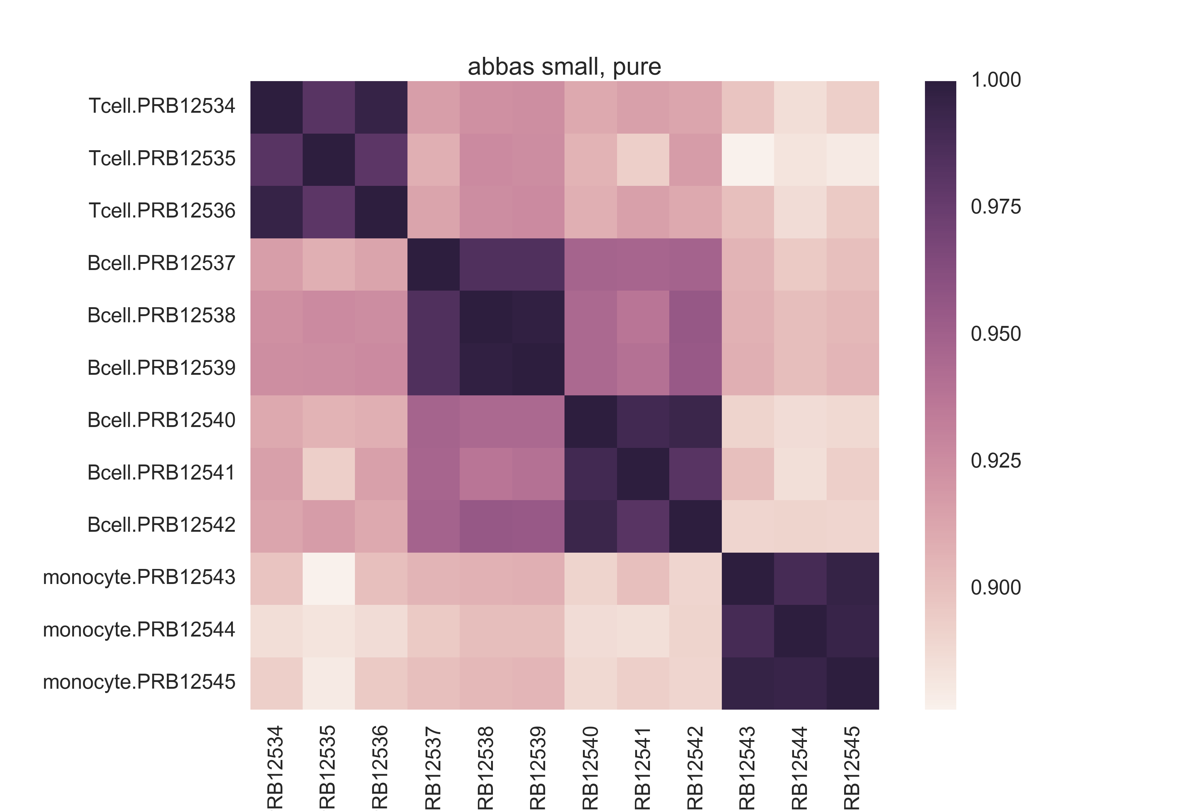
Here is a pairwise Pearson correlation matrix from the raw data of Abbas 2009's first experiment. Notice the scale -- poor absolute differentiation, though there seems to be signal hidden in the data.
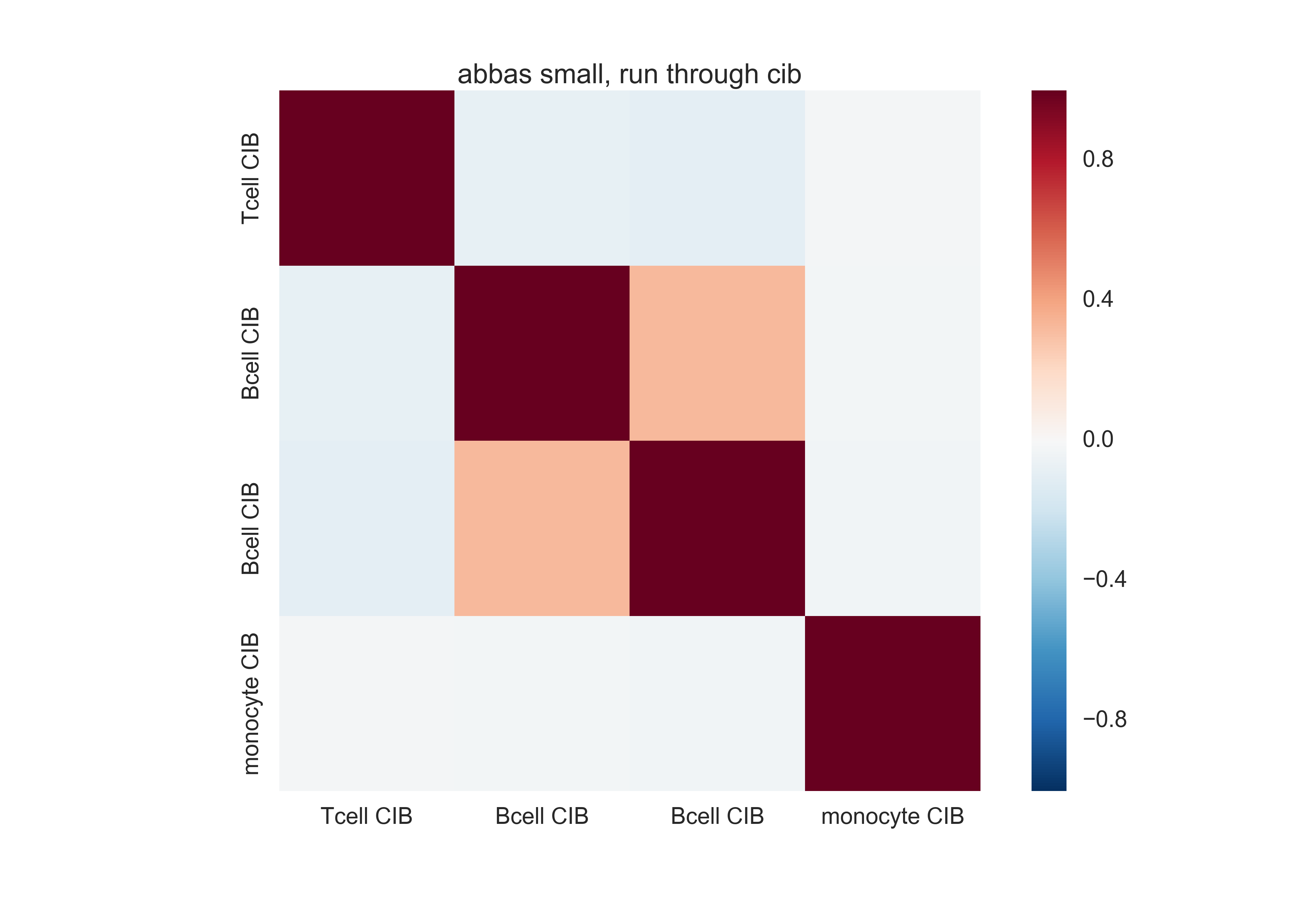
Here is a similar matrix from the basis matrix Cibersort made out of this. Much better differentiation, in terms of the absolute scale.
Differences between methods
What is being included
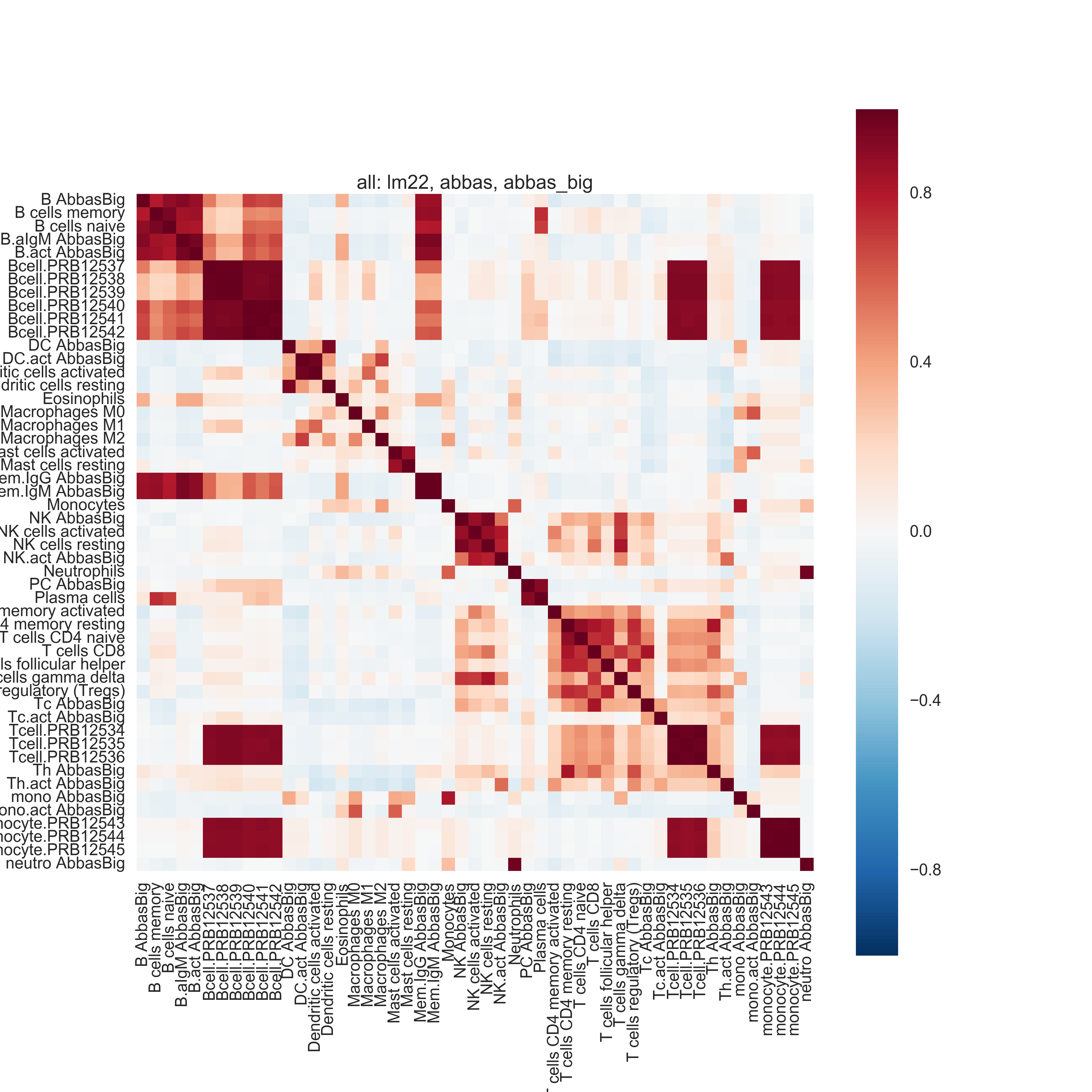
Biological pathways of individual cell types and connections between similar cell types are recovered -- even when combining the outputs of different methods from different datasets. Some methods seem to be noisier than others. Marker gene lists are different but include the same pathways.
The marker gene lists have mostly different genes but represent many of the same pathways. IRIS has more noise though -- e.g. lots of cell division pathways. See section 2.1.1 of the writeup for the GO tables.
Pairwise Pearson correlation and hierarchical clustering on the basis matrices recover biological similarities between certain cell types. (There is one exception: gamma delta T cells -- however these have been flagged as problematic and may be ignored.) These patterns are generally preserved across methods and across datasets.
# convert the LM22 heatmap made in R to a PNG and rotate it
!convert -density 300 data_engineering/plots/lm22.pdf -resize 50% -rotate 90 data_engineering/plots/lm22.png
What is the discriminatory ability?
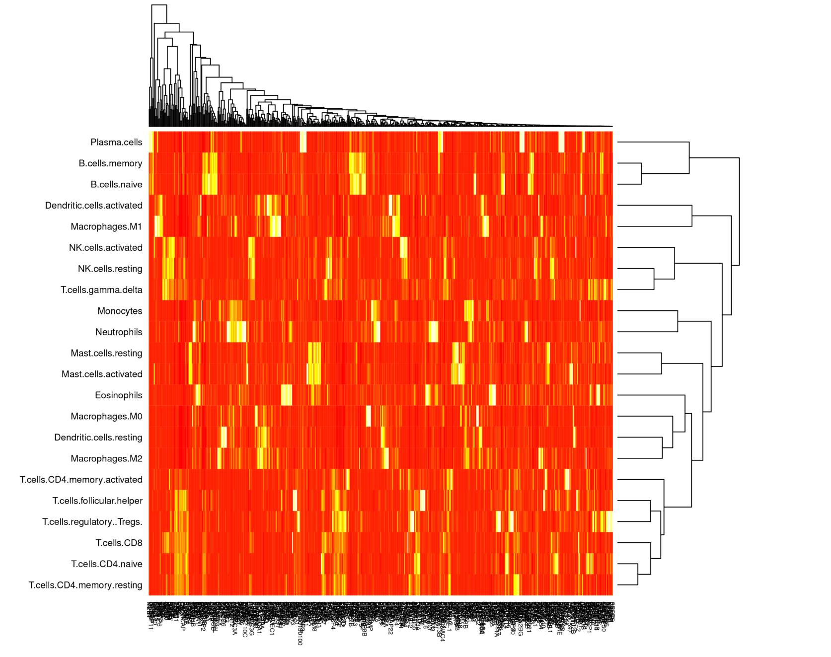
Overall, the condition number of the basis matrices is low, but there are some cell types that are very similar and hard to differentiate.
The condition number of the basis matrices is low: LM22's is 11.38 (0 is best). When one of each of the two pairs of most similar cell types is removed, the condition number decreases to 9.30.
The most similar cell types are:
- B cells memory, naive
- CD4 T cells naive, memory resting
Deconvolution in progressively more complicated synthetic mixtures
We expect there to be several pathological cases:
- Distinguishing between two very similar immune cell subtypes
- Distinguishing between very broad cell types -- Cibersort may fail as-is on superset classification, but will probably do well with a different training set.
It will be interesting to see what the diagnostics tell us in both cases.
Experiment 1: reproducing result
First, using Cibersort, I reproduced deconvolution of example mixtures that come with Cibersort. I got $R^2 > 0.99$. (notebook)
Experiment 2: simple deconvolution
Next, I deconvolved weighted sums of two quite different columns: naive B cells and Tregs. I either added no noise, or added one of two types of noise:
- "simple" noise: Gaussian error added to each gene after the weighted sum
- "complex" noise: Gaussian error added to each element of the weights matrix (n_genes x n_celltypes) for the weighted sum
Results (notebook):
- Deconvolving reference profiles with no noise, with simple noise, and with complex noise:
- $R^2 = 1.0, 1.0, .99$, respectively. At most 3% error in the cell types we care about.
- Noise has a small impact. Here is the absolute deconvolution error in the three noise conditions:
B cells naive T cells regulatory (Tregs) 0 -0.001063 -0.000304 1 -0.001573 -0.000498 2 -0.013319 -0.032256 - However, as expected, noise makes Cibersort less certain that other cell types are not there -- it started hallucinating positive fractions for other cell types. In the no-noise and simple-noise conditions, the highest hallucinated abundance is 0.07%; in the complex-noise condition, the highest hallucinated abundance is 3.5%.
- Deconvolving raw samples with with no noise, with simple noise, and with complex noise:
- $R^2 = .98, .97, .98$, respectively.
- B cells naive have poor deconvolution consistently: 9-11% off. Tregs have low error (1-3%). Here are the absolute deconvolution errors in the three noise conditions:
B cells naive T cells regulatory (Tregs) 0 -0.106105 -0.010682 1 -0.107512 -0.011141 2 -0.089686 -0.031552 - B cells memory (very similar cell type) is being hallucinated in at 2% error. 4% error rate for T cells follicular memory -- meaning a lot of hallicunation of that for some reason (maybe similar to Treg?). Also consistent regardless of noise.
In first experiment, we have pretty good deconvolution throughout w/ p-values = 0. But in second experiment, naive B cells are consistently 10% off, but Cibersort still says p-value = 0. $R^2$ is still high, so maybe this is not bad.
Experiment 3: pathological case of very similar cell types
I deconvolved weighted sums of two very similar cell types: naive and memory B cells. Again, I used reference profiles and raw cell lines with three noise conditions, as above.
Results (notebook):
- Reference profiles: perfect deconvolution.
- $R^2 = 1.0, 1.0, 1.0$.
- Absolute error in the three noise conditions:
B cells naive B cells memory 0 0.000715 -0.001720 1 0.000361 -0.001691 2 -0.007141 0.000923 - P values all 0.
- Raw cell lines: bad deconvolution:
- $R^2 = 0.97, 0.97, 0.98$. As expected, lower than for reference profiles. Noise helps slightly (why?)
- Absolute error in the three noise conditions:
B cells naive B cells memory 0 -0.106118 0.035980 1 -0.104301 0.036218 2 -0.090453 0.005164 - This deconvolution is consistently bad, yet $R^2$ is high and $p=0$ always. In the 50-50 mixture, looks like B cells memory are favored.
- Hallucination of CD4 memory resting T cells (1.7%), resting dendritic cells (1.3%). (All others are at < 1%)
This particular naive B cell line is always underestimated by 10%, weird.
Even when $p=0, R^2$ is high, we get bad deconvolution -- errors of 10% or more.
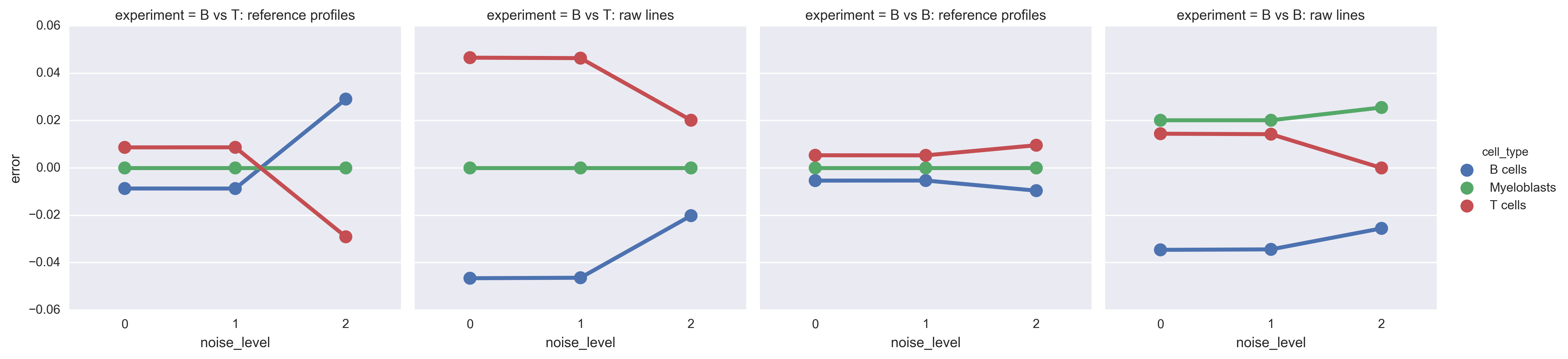
Experiment 4: superclass classification
I retrained Cibersort on some superclasses from the same input data: B cells, T cells, and myeloblasts. I created a new basis matrix exactly in the way that LM22 was created (which I had verified earlier).
The basis consisted of:
- B cells: "plasma cells" and "B cells*"
- Myeloblasts: "Monocytes" + "Macrophages.M0" + "Eosinophils" + "Neutrophils"
- T cells: "T cells"
Then I used the new basis matrix with Cibersort to deconvolve the same mixtures as above:
- B cell naive 25%, Treg 75%
- reference profiles
- two raw cell lines
- B cell naive 50%, B cell memory 50%
- reference profiles
- two raw cell lines
Here is the plot of absolute differences:
Do RNA-seq purified cell lines have the same properties as microarray lines?
I downloaded and processed 63 samples of purified T cells and B cells (see behavior_of_rnaseq_data).
The specific subtypes:
- T: CD4+ naive, CD4+ TH1, CD4+ TH2, CD4+ TH17, CD4+ Treg, CD4+ TCM, CD4+ TEM, CD8+ TCM, CD8+ TEM, CD8+ naive
- B: naive, memory, CD5+
According to the paper that describes the voom transform, RNA-seq counts/million data can be modeled just like microarray data after a log transformation and with specific weights to control for heteroscedasticity. I have only done the log transformation so far -- I have not examined the weights. Also, I used log2-TPM, not log2-CPM. Within-sample normalization may play a role, so I should re-examine this.
What happens when you compare microarray data to RNA-seq data?
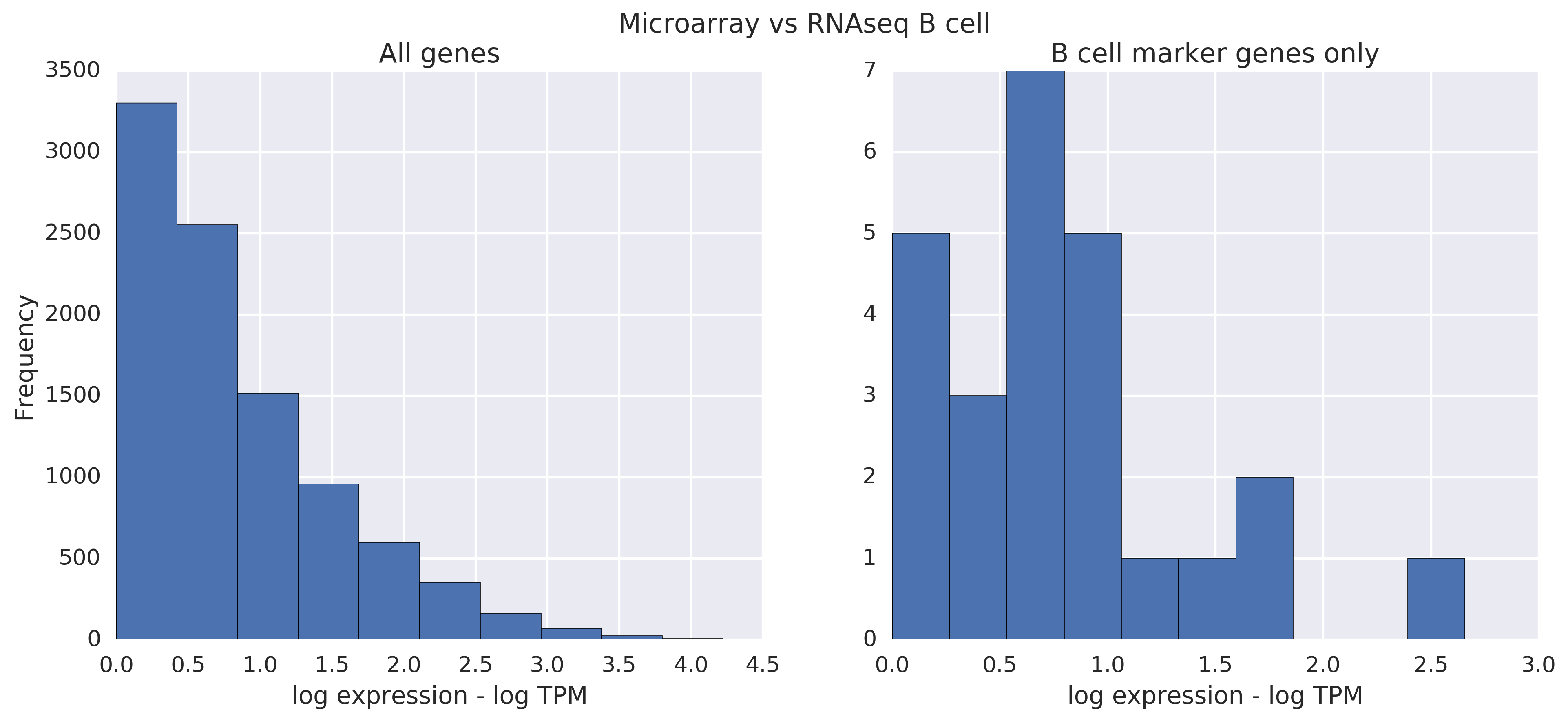
First, as a baseline, what do microarray lines from the same cell type look like when we take the absolute difference between the two? The difference is hard to notice:
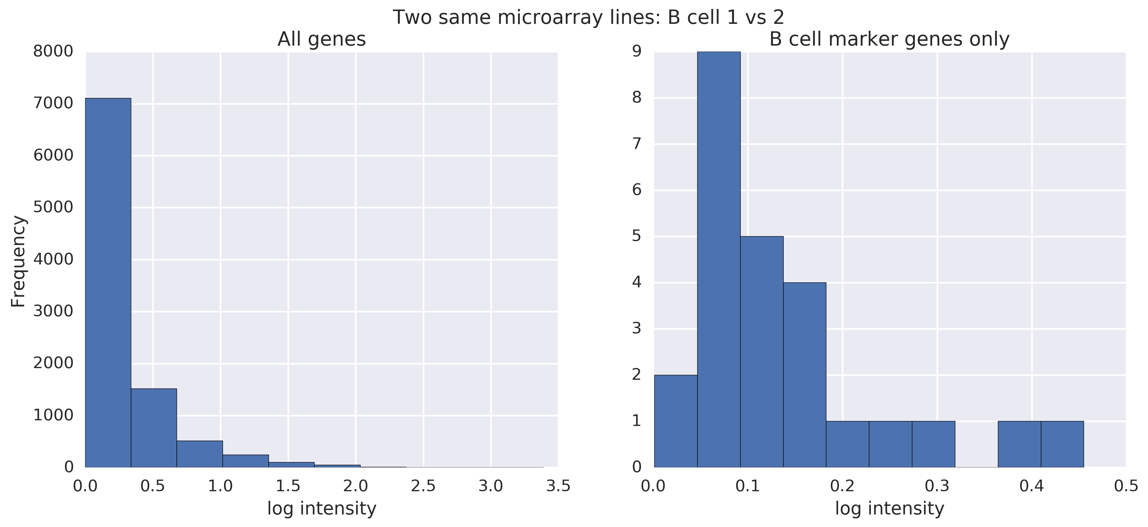
This is from two raw B cell lines. On the left are all genes. On the right, I've filtered to the genes that Bindea called B cell marker genes.
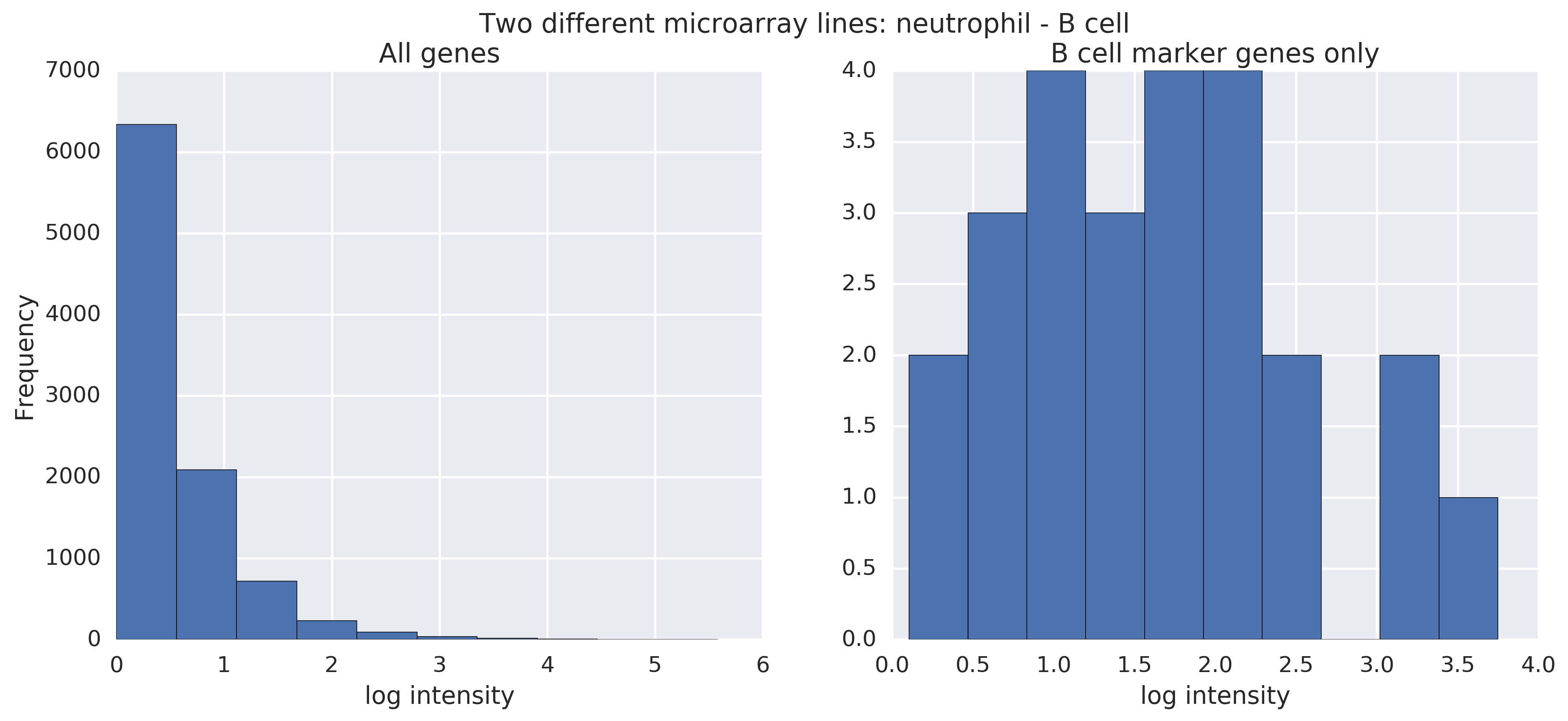
Now, as another baseline, what do microarray lines from different cell types look like when compared? Now, the difference is noticeable (see the horizontal axis), especially when looking at B cell marker genes in particular. (We're comparing a neutrophil raw line to a B cell raw line.) There's noise in raw lines, so the filtering is important here.
Let's now look at the same comparisons for RNA-seq data. What do RNA-seq lines from the same cell type (B cells) look like?
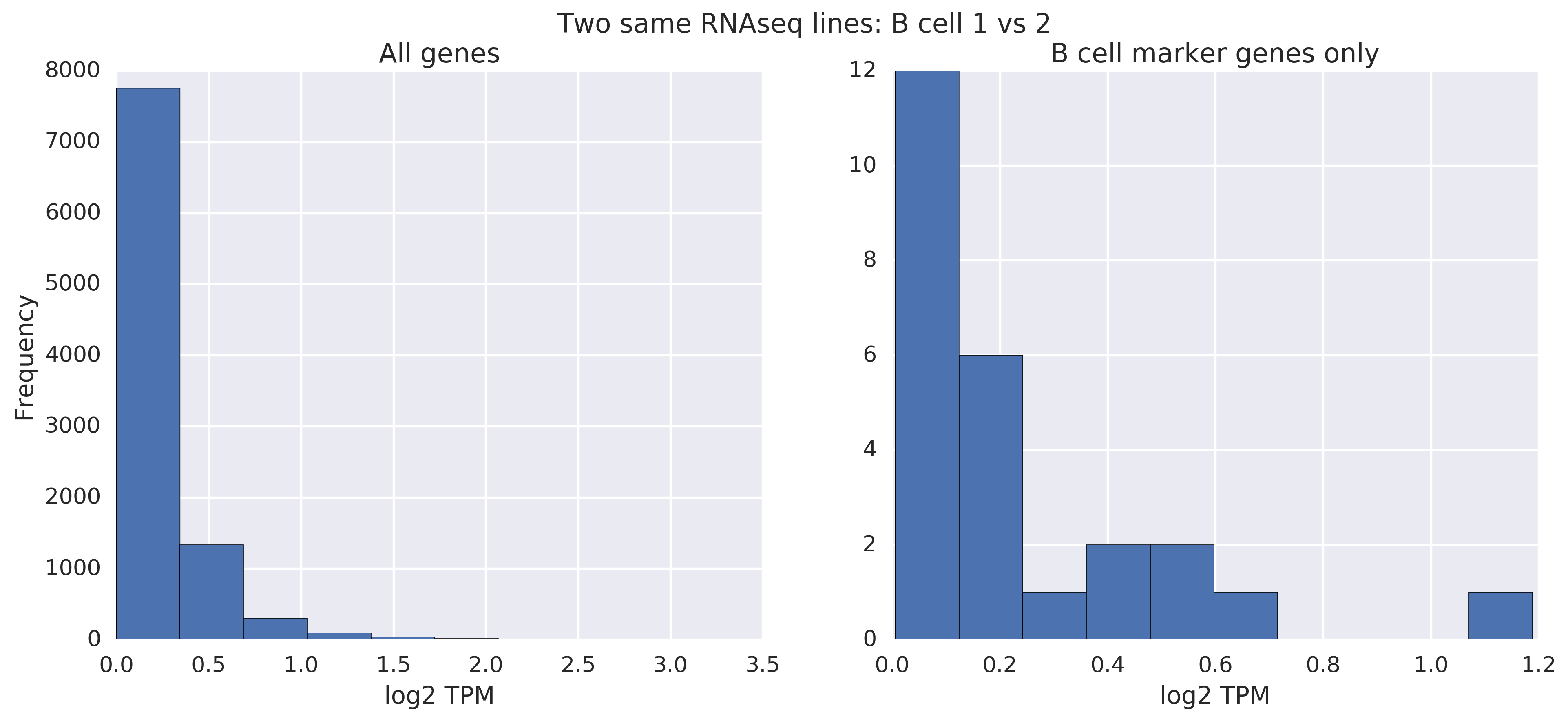
Like with the analogous microarray analysis, even without filtering, you can easily tell that they're pretty similar.
When comparing RNA-seq lines from different cell types -- in this case, a Treg line vs a B cell line -- the story becomes more interesting. Without filtering, it's hard to tell that there's a difference. With filtering, you can tell by the scale:
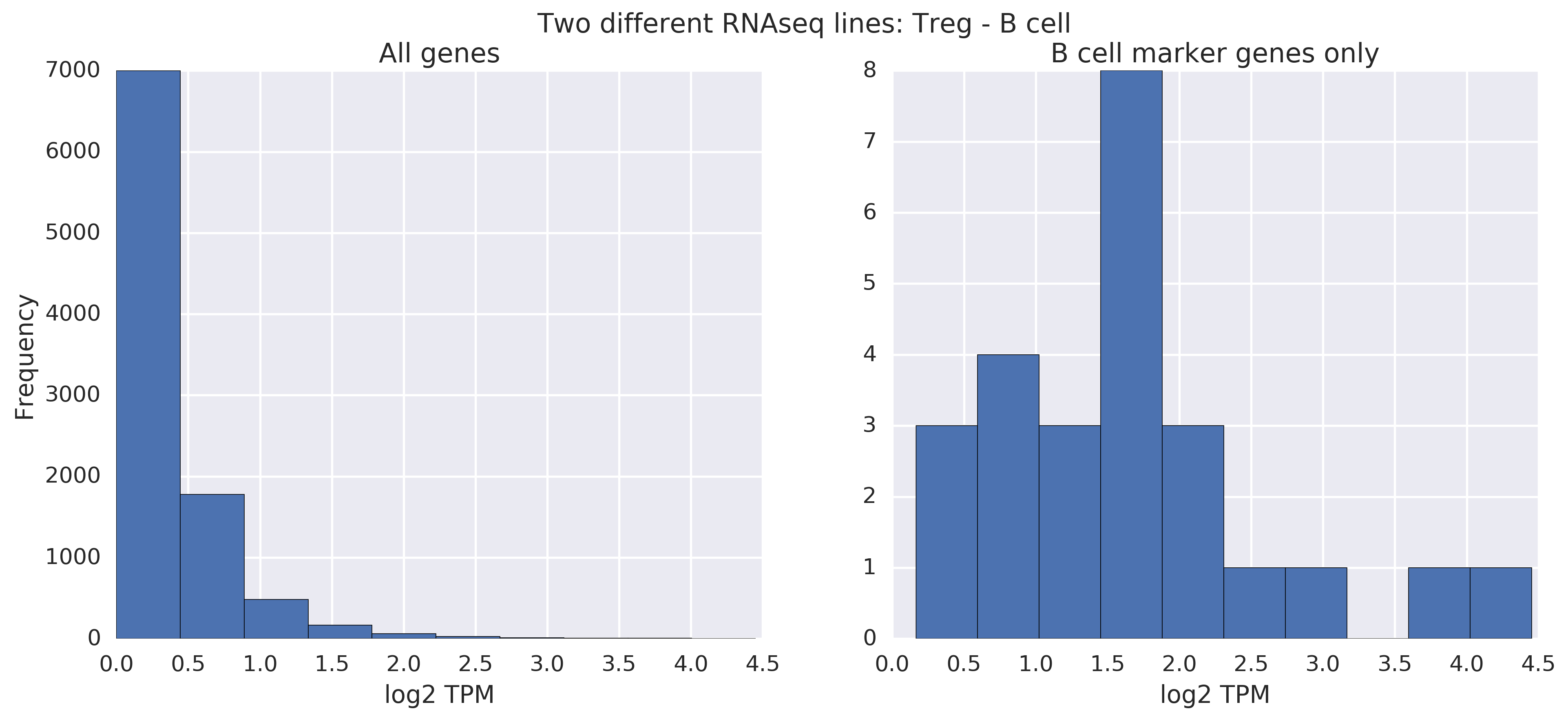
We've demonstrated that you can tell apart RNAseq lines from different cell types, but not from the same cell type. Phenotype distinctions exist and are readily visible if you filter to the right genes! The same is known to be true about microarray data, and we saw it above.
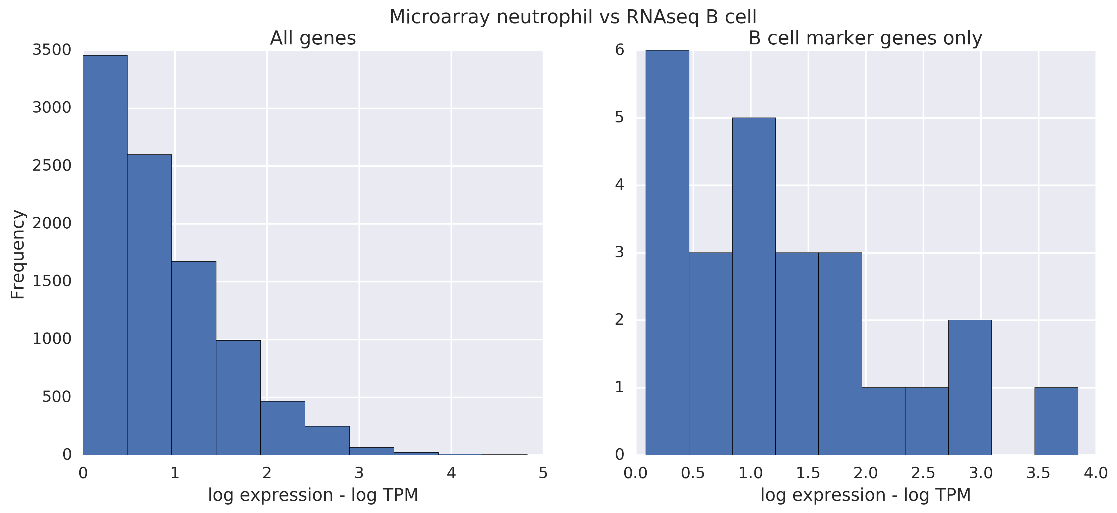
Now let's compare microarray lines to RNA-seq lines directly. When the lines are from the same cell type, there's some, but not all that much of a difference. Filtering helps slightly. Note that there is more noise in this comparison than before.
But when you compare a neutrophil microarray raw line to a B cell RNA-seq raw line, you see a difference. However, in these comparisons, it's much less clear whether different or same. The max mark on the scale is the only giveaway, and it's a change of ~ 1; in microarray vs. microarray or RNAseq vs RNAseq, the difference was around 3. This is all on the log scale though, so there's some signal there, but RNAseq vs microarray seems a little more unruly.
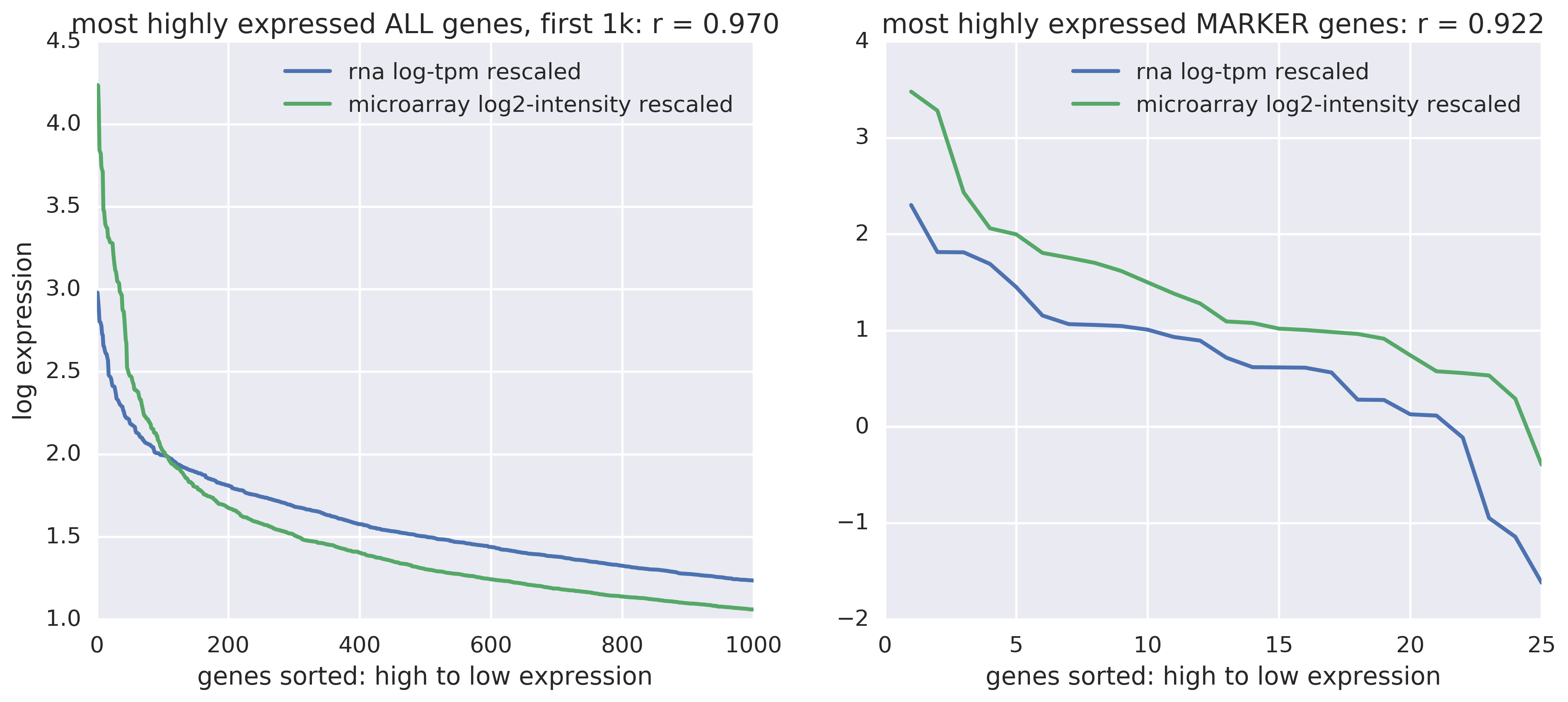
Do highly expressed genes follow the same patterns?
Yes, there's a constant offset but they track quite well (see the correlation scores). On the right are B cell marker genes only. On the left are all genes -- and there's some bizarre intersection there, but overall a similar constant absolute difference throughout.
How does the ratio between most highly and second most highly expressed genes compare between microarray and RNA-seq data?
- In RNA-seq data: 3.76.
- In microarray data: 3.46.
Proof-of-concept hierarchical classification model
We saw above that supersets can be classified with low error. We can build a hierarchical classification model using a local binary classifier at each node in the hierarchy. There are several key questions:
- How to choose training examples? Positive examples can be the node and its descendants, and negative examples can be everything that's not the node, its descendants, nor its ancestors
- How to correct for inconsistent class membership in testing? We can evaluate the classifiers top-down or take the product of posterior probabilities to avoid contradictory classifier outputs like
{Class 1: false; Class 1.1: true}. - How should we evaluate performance? Standard classification scores penalize errors at different levels of the hierarchy in the same way, but we should penalize generalization error (making a prediction that's too generic) more than we penalize specialization error (making a prediction that's too specific -- which can be a good thing). The literature defines new hierarchical precision and recall metrics.
- How do we decide whether to stop early or to continue down the hierarchy? A simple approach is to stop when our confidence drops below a threshold, but we might falsely reject at a high level. The literature suggests linking layers of classifiers with multiplicative thresholds or with secondary classifiers that decide whether to continue or stop.
- What hierarchy should be used? It's not clear that the phylogeny should be the hierarchy of choice, because more specific cell types are further differentiated and may not express what was being expressed earlier in development.
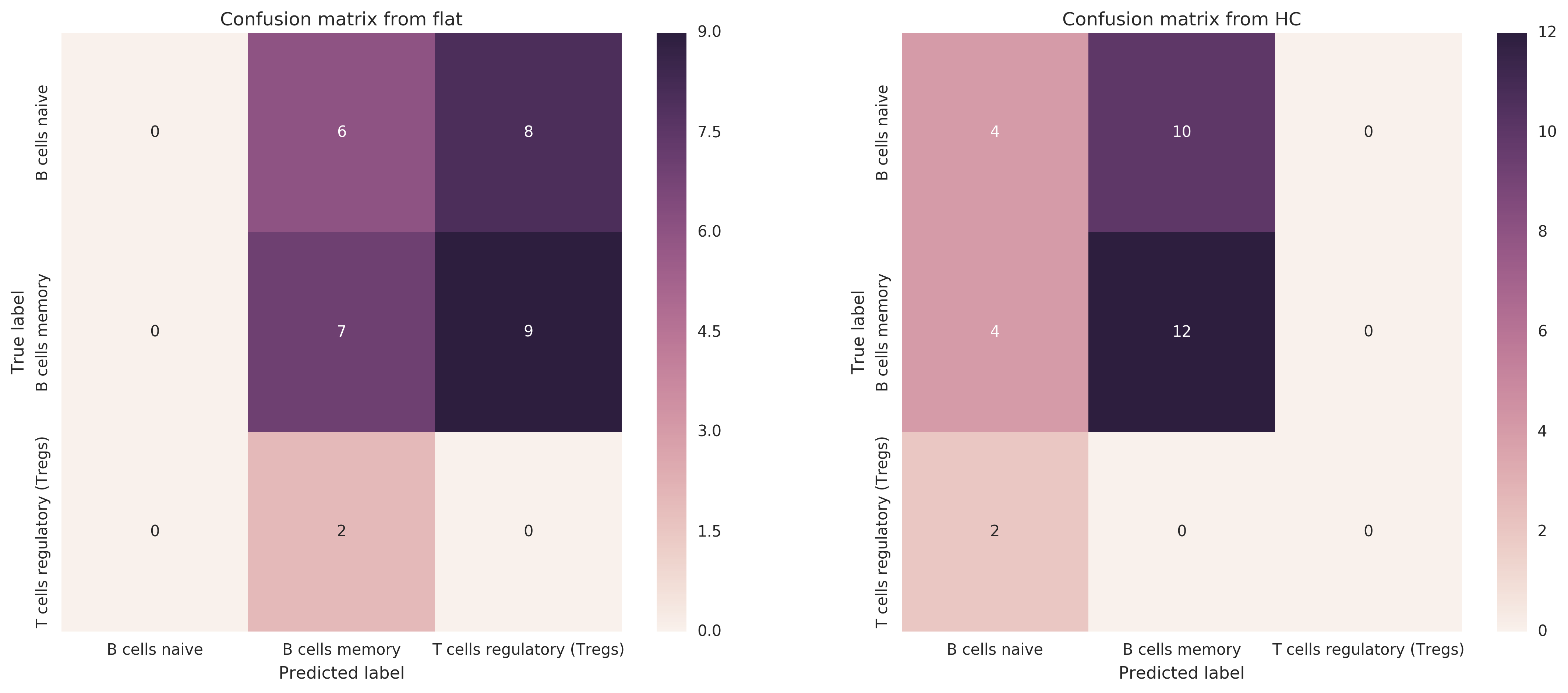
Hierarchical classification improves hF by 0.36
I made a proof-of-concept with classifying B cells naive vs B cells memory vs Tregs raw lines -- purified raw lines only, for now. I compare a flat classifier to one that models the hierarchy of root → {B cells, T cells}, B cells → {naive, memory}, T cells → {Tregs}.
I train on LM22 reference profiles, binary classifier for whether a sample s is of that type For training, positive examples are the class and its descendants, and negative examples are everything except the class, its descendants, and its ancestors. Then I test on raw lines from all expression data (not just from LM22). I compute multiplicative probability of each leaf class and return the highest.
- Improvement, in terms of standard F1, from switching from flat to hierarchical classifier: 0.22 --> 0.5 (increase of 0.28)
- Improvement in terms of hF (hierarchical F1 score): 0.37 --> 0.73 (increase of 0.36)
Here are the confusion matrices of each classifier -- there is clearly some work to be done to improve the classification.
Conclusions
- Diagnostics ($p, R^2$) are not informative, and are misleading if anything.
- Some cell types are very poorly deconvolved -- e.g. B cells naive. We don't even need noise to make a pathological case.
- There is clear motivation for hierarchical classification: see the hierarchical clustering plot from earlier, the above disappointing experiment with differentiating very similar classes, and the above successful experiment with superclass classification.
- There is a lot of variance in immune cell expression that is not captured by the methods.
- The linearity assumption holds for RNA-seq data that has been log-transformed, meaning it behaves much like microarray data.
- Hierarchical classification clearly helps
Next steps
RNA-seq
- How to perform between-sample normalization for RNA-seq data?
- How do RNA-seq mixtures behave? Are they linear?
- How does quantification method determine results?
- Technical variability among samples from same cell type
- Pearson correlation over all lines of all cell types -- can you recover similarity?
Variance
- Investigate influence of tumor vs blood origins, varying tissues of origin.
- Merge those histograms by gene to see a more accurate distribution -- right now showing probesets though Cibersort has gene-level specificity.
Deconvolution
- Are these results consistent across replications? Maybe the randomness of the noise is playing a role in which experiments noise is killing and which it isn't?
Hierarchical classification
- How to do hierarchical mixture deconvolution? Train a multi-level generative model with variance incorporated.
- Test proof of concept with partial labeling of B cells if not confident enough to go to B cells naive vs B cells memory
- What's the right hierarchy to use? How much does it matter?